

2014 Health Center Patient Survey Dashboard User Manual
Options
In addition to the core features of the dashboard, other options are also available. These options appear beside the chart (or below it on mobile devices).
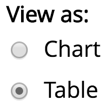
View As
The View As option allows you to decide whether to view the prevalence estimates in chart form or table form. The chart is generally better for a broad visual overview. The table is generally better for seeing the exact numbers.
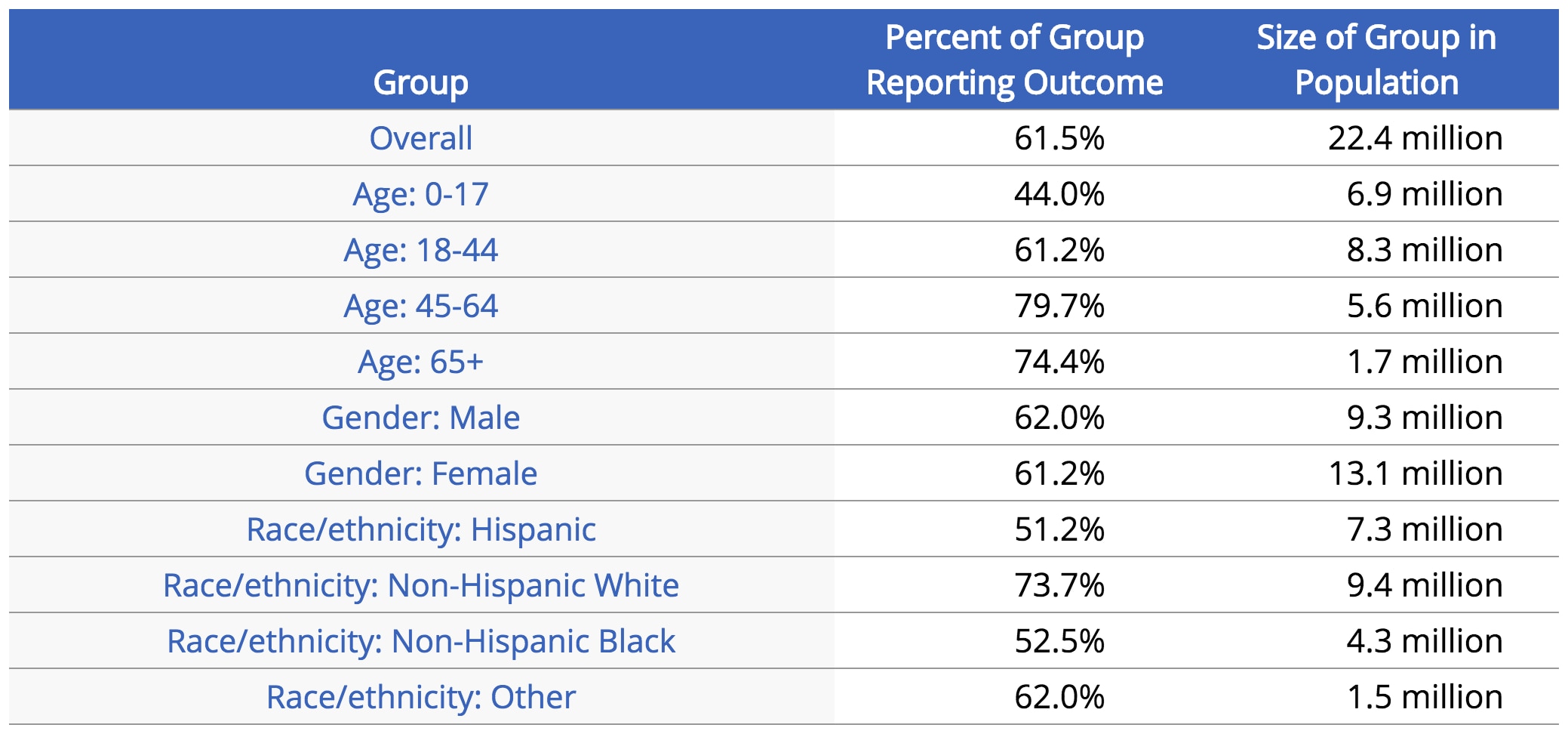
Figure 7: Dashboard data presented in table view
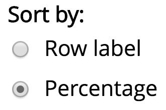
Sort By
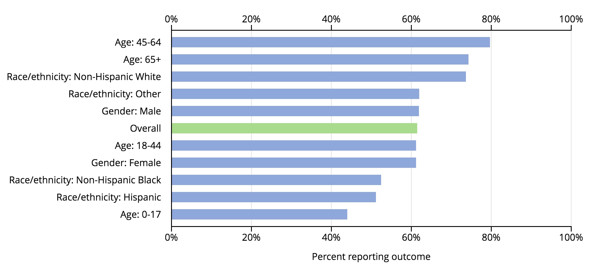
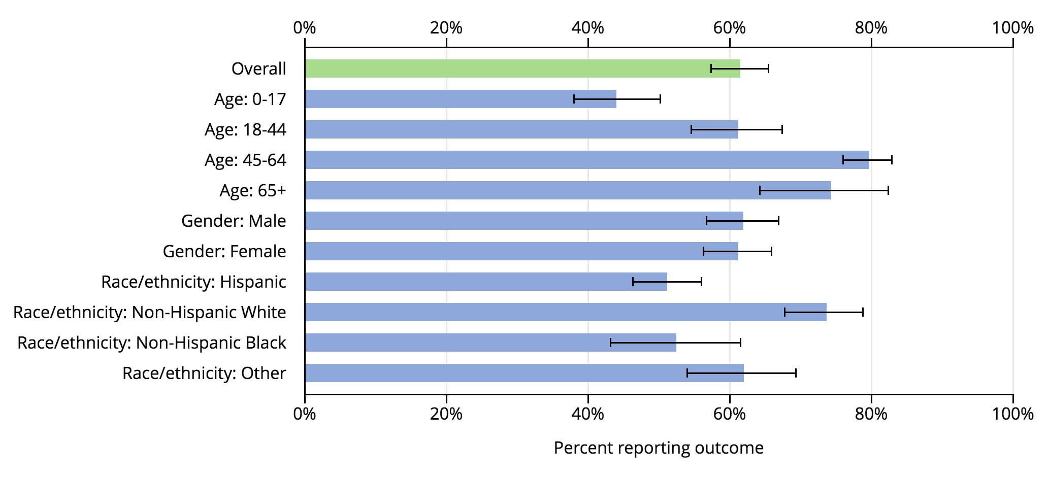
The Sort By option allows you to change how the chart rows are arranged. If you choose Row label, the rows are grouped by demographic characteristic. For example, the “Gender: Male” and “Gender: Female” rows will appear one below the other. If you choose Percentage, the rows are arranged in decreasing order of prevalence. The demographic group with the highest prevalence will appear at the top of the chart, and the demographic group with the lowest prevalence will appear at the bottom.
Figure 8: Chart sorted by percentage
Confidence Intervals
The Confidence Intervals option allows you to display a 95 percent confidence interval for each prevalence estimate displayed in the chart. Confidence intervals reflect the range of variation in the estimation of each percentage (of the health center population or demographic group) reporting an outcome. The width of a confidence interval reflects the relative accuracy or precision of the prevalence estimate. Relative precision may reflect a small sample size or greater diversity among patients with respect to a particular outcome. Estimates with wider confidence intervals indicate uncertainty in the prevalence estimate and tend to be less reliable.
Figure 9: Chart with confidence intervals visible
![]()
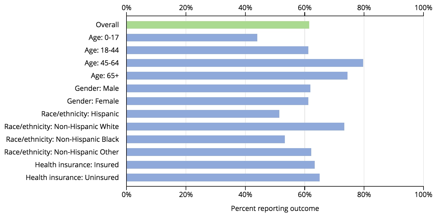
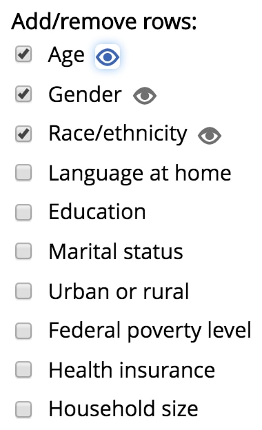
Add/Remove Rows
The Add/Remove Rows section allows you to control which demographic groups appear as rows in the chart. By default, the only demographics that appear in the chart are those for age, race/ethnicity, and gender. However, several more are available. Checking a checkbox will add the associated rows to the chart, and unchecking it will remove the associated rows.
Figure 10: Chart with health insurance rows added
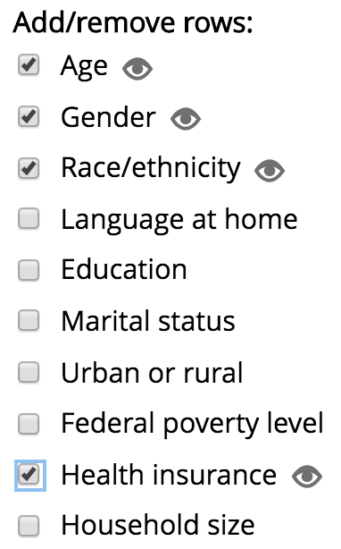
Highlight Rows
For each set of rows you have added to the chart, the Highlight Rows icon will appear. This icon looks like an eye (![]() ). Clicking it will highlight the associated rows on the chart so that you may see them better. For example, clicking the icon for “Age” will highlight the age category rows in the chart. Highlighting rows may be useful when the chart contains many rows, but you may want to focus only on the rows for one particular demographic characteristic.
). Clicking it will highlight the associated rows on the chart so that you may see them better. For example, clicking the icon for “Age” will highlight the age category rows in the chart. Highlighting rows may be useful when the chart contains many rows, but you may want to focus only on the rows for one particular demographic characteristic.
Figure 11: Chart sorted by percentage with age rows highlighted
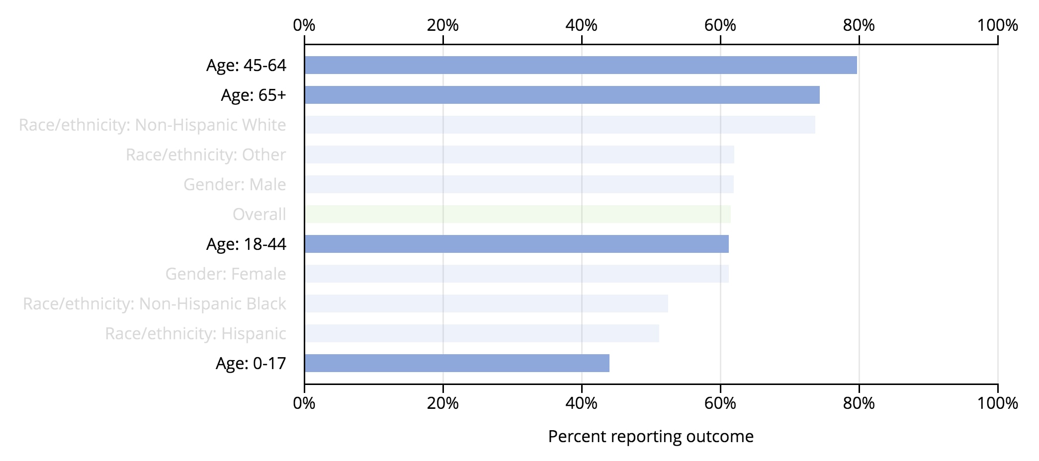
After you click a Highlight Rows icon, the rows stay highlighted until you click it again or you click a different icon. Only one icon may be active at a given time. For example, if you have highlighted the “Gender” rows, then clicking the icon for the “Age” rows will first remove the highlighting for the “Gender” rows, and then it will highlight the “Age” rows.
Download CSV
The Download CSV button allows you to download a file containing the prevalence estimates presented in the chart. The prevalence estimates are saved as a comma-separated values (CSV) text file, which you can open in spreadsheet software such as Microsoft Excel or most data analysis software packages. This may be useful if you would like to create your own chart or table from the data.